Kusto Time Series Analysis for Azure Resources (Forecast, Anomalies)
Introduction
Azure Monitor Logs is based on Azure Data Explorer, and log queries are written by using the same Kusto Query Language (KQL). This rich language is designed to be easy to read and author, so you should be able to start writing queries with some basic guidance.
Kusto Query Language (KQL) contains native support for creation, manipulation, and analysis of multiple time series. With KQL, you can create and analyze thousands of time series in seconds, enabling near real time monitoring solutions and workflows.
The Kusto Query language (KQL) is having a few interesting functions for Anomaly detection and forecasting.
In this article I will explain how to use these functions for Azure platform resource performance metric data stored in Logs in a Log Analytics Workspace.
Exporting platform metrics to Logs
Theory
You can export the Azure platform metrics from the Azure monitor pipeline to Azure Monitor Logs (and thus Log Analytics).
The export can be configured using the diagnostic setting for an Azure resource
The Azure platform metrics performance data is stored in the AzureMetrics table contains Metric data emitted by Azure services that measure their health and performance.
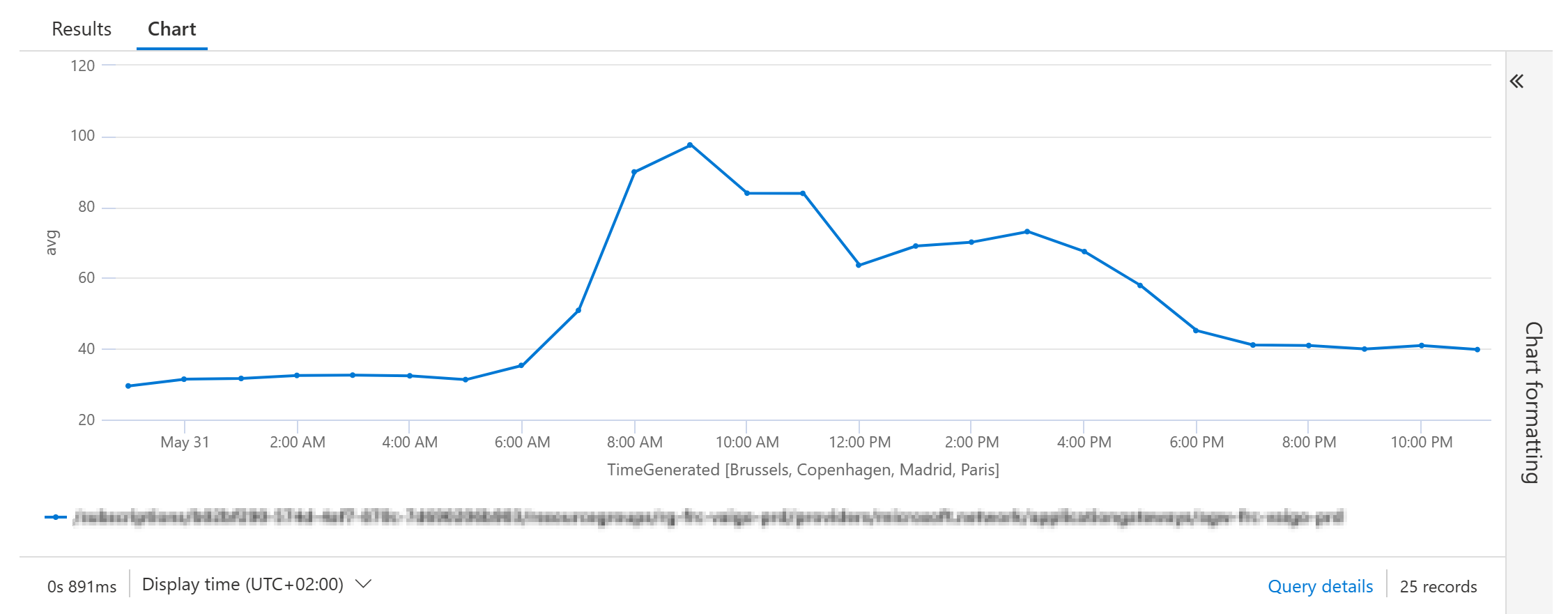
Timechart Example
A regular query to display a timechart for the Average CurrentConnections for an Application Gateway could be:
Example Query
AzureMetrics
| where ResourceId =~ "**your Application Gateway resource id**"
| where MetricName =~ "CurrentConnections"
| summarize
    avg = avg(Average)
    by
    ResourceId=tolower(ResourceId),
    bin(TimeGenerated, 1h)
| render timechart
Result:
Time Series Creation using ‘make-series’
The first step in time series analysis is to partition and transform the original telemetry table to a set of time series. The table usually contains a timestamp column, contextual dimensions, and optional metrics. The dimensions are used to partition the data. The goal is to create thousands of time series per partition at regular time intervals.
This is done by using the make-series operator.
make-series CurrentConnections=avg(avg) on TimeGenerated from ago(30d) to now(-1d) step 1h
In this example the average CurrentConnections are calculated on the Timestamp field TimeGenerated from 30 days ago until yesterday it will generate a timeseries with an interval of 1h samples.
Example Query
AzureMetrics
| where ResourceId =~ "**your Application Gateway resource id**"
| where MetricName =~ "CurrentConnections"
| summarize
    avg = avg(Average)
    by
    ResourceId=tolower(ResourceId),
    bin(TimeGenerated, 1h)
| project
    avg,
    ResourceId,
    TimeGenerated
| make-series CurrentConnections=avg(avg) on TimeGenerated from ago(30d) to now(-1d) step 1h
Result

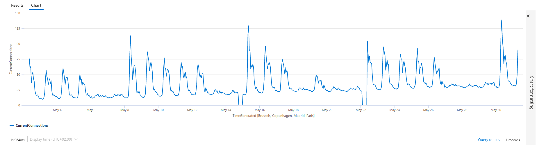
The result shows a set of time series, the average of the CurrentConnections with an interval of 1 hour from 30 days ago until yesterday.
Example Query with timechart
You can add the render operator to viualize the results in a timechart:
AzureMetrics
| where ResourceId =~ "**your Application Gateway resource id**"
| where MetricName =~ "CurrentConnections"
| summarize
    avg = avg(Average)
    by
    ResourceId=tolower(ResourceId),
    bin(TimeGenerated, 1h)
| project
    avg,
    ResourceId,
    TimeGenerated
| make-series CurrentConnections=avg(avg) on TimeGenerated from ago(30d) to now(-1d) step 1h
Result
Forecasting
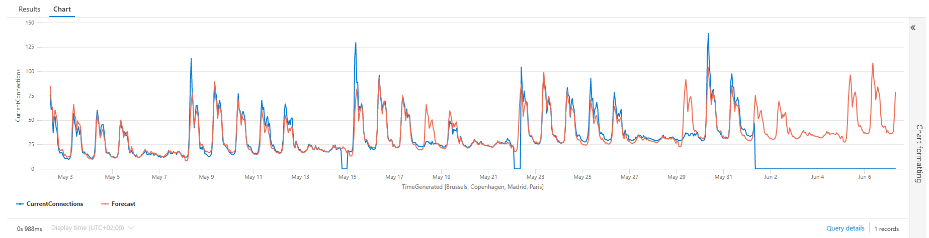
Now it is getting interesting. The Kusto query language has a function to decompose the timeseries using a well-known decomposition model, where each original time series is decomposed into seasonal, trend, and residual components and add predicts the values of the future timeline to it.
This is done using the series_decompose_forecast() function.
Syntax
series_decompose_forecast(Series, Points, [ Seasonality, Trend, Seasonality_threshold ])
Example Query
Note that I’ve added some variable declerations in the beginning: min_t, max_t, dt and horizon
The make-series operator is changed to extend the period to 7 days in the future (max_t+horizon).
The Forecast is added with the series_decompose_forecast() function based on the CurrentConnections in the time series.
The number of points are calculated from the number of days în the forecast devided by the interval: ‘horizon / dt’
let min_t = ago(30d);
let max_t = now(-1d);
let dt = 1h;
let horizon=7d;
AzureMetrics
| where ResourceId =~ "**your Application Gateway resource id**"
| where MetricName =~ "CurrentConnections"
| summarize
    avg = avg(Average)
    by
    ResourceId=tolower(ResourceId),
    bin(TimeGenerated, 1h)
| project
    avg,
    ResourceId,
    TimeGenerated
| make-series CurrentConnections=avg(avg) on TimeGenerated from min_t to max_t+horizon step dt
| extend Forecast = series_decompose_forecast(CurrentConnections, toint(horizon / dt))
| render timechart
Query Result
The series_decompose_forecast() function adds the series for the number of points stated in the function. Resulting in a cool timechart with a future Forecast timeline:
Anomaly Detection
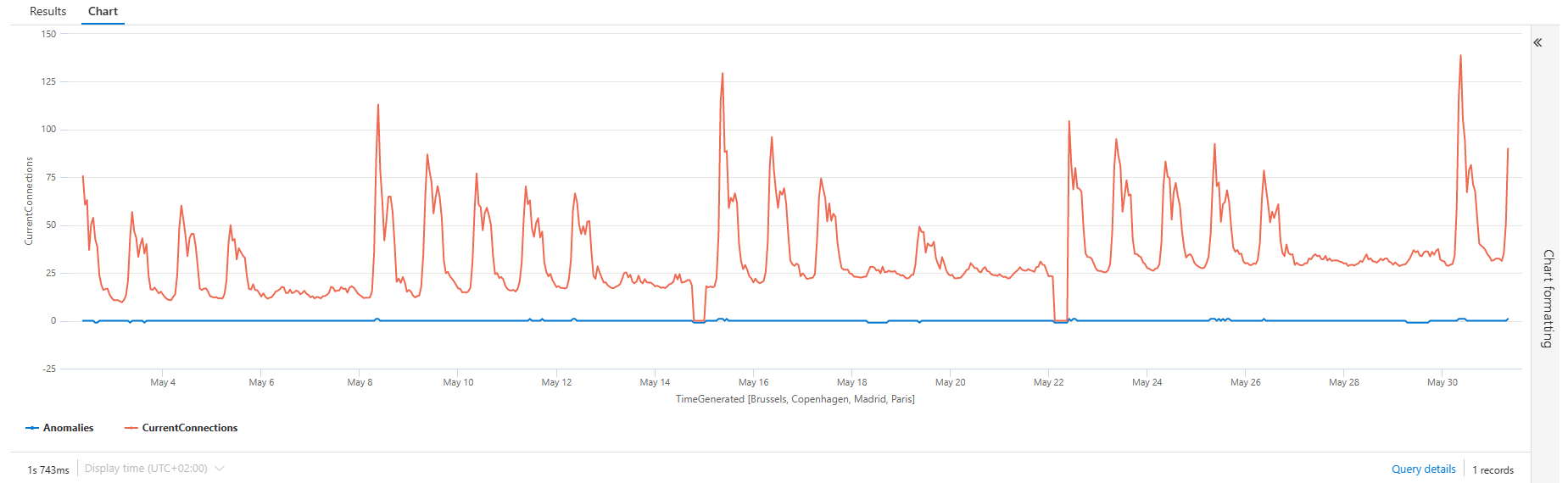
Similar to the series_decompose_forecast() the function series_decompose_anomalies() is based on series decomposition. The function takes an expression containing a series (dynamic numerical array) as input, and extracts anomalous points with scores.
Syntax
series_decompose_anomalies (Series, [ Threshold, Seasonality, Trend, Test_points, AD_method, Seasonality_threshold ])
Example Query
let min_t = ago(30d);
let max_t = now(-1d);
let dt = 1h;
AzureMetrics
| where ResourceId =~ "**your Application Gateway resource id**"
| where MetricName =~ "CurrentConnections"
| summarize
    avg = avg(Average)
    by
    ResourceId=tolower(ResourceId),
    bin(TimeGenerated, dt)
| project
    avg,
    ResourceId,
    TimeGenerated
| make-series CurrentConnections = avg(avg) on TimeGenerated from min_t to max_t step dt
| extend (Anomalies) = series_decompose_anomalies(CurrentConnections, 1.5, -1, 'linefit')
| render timechart
Query Result
The result is nice, adding a Anomalies timeline for the anomalies. -1 showing a lower anomaly, +1 showing a higher anomaly.
The only disadvantage is that the anomalies is hard to see if the values of the timeseries are higher.
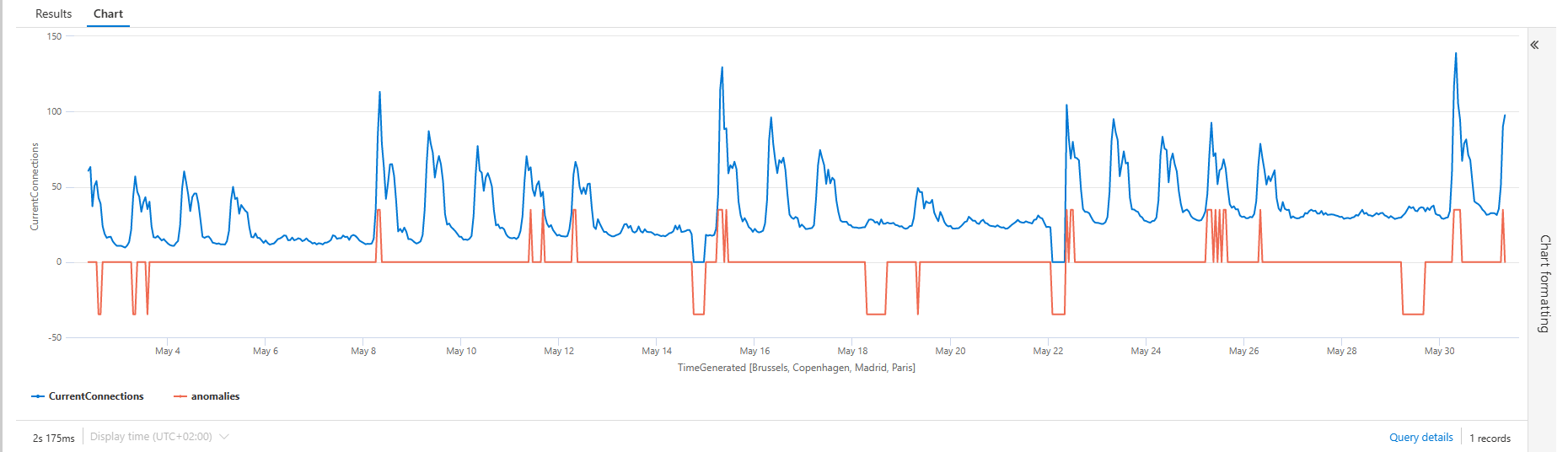
Example Query (fixing the scale of the anomanies)
You can fix the scaling of the Anomalies timeline by taking a toscalar() of the average overtime, and apply a series_multiply() to the time series:
let grain = 1h;
let metric_scale = toscalar(
    AzureMetrics
    | where ResourceId =~ "**your Application Gateway resource id**"
    | where MetricName =~ "CurrentConnections"
    | summarize
        avg = avg(Average)
    | summarize avg(avg));
AzureMetrics
| where ResourceId =~ "**your Application Gateway resource id**"
| where MetricName =~ "CurrentConnections"
| summarize
    avg = avg(Average)
    by
    ResourceId=tolower(ResourceId),
    bin(TimeGenerated, 1h)
| project
    avg,
    ResourceId,
    TimeGenerated
| make-series CurrentConnections = avg(avg) default = 0 on TimeGenerated from ago(30d) to now(-1d) step grain
| extend (anomalies) = series_decompose_anomalies(CurrentConnections, 1.5, -1, 'linefit')
| extend anomalies =
    series_multiply(metric_scale, anomalies) // multiplied for visualization purposes
| render timechart
Query Result
The result is showing a easier interpretable output:
Conclusion
The time series analysis functionality is realy easy to use and showing lost of potential.
In a future post, I will show you can dynamically visualize the data for Azure Platform Resources using Azure Workbooks.